
It is important as a developer to analyze the technology as well as its pros and cons before following a trend of adopting it for the sake of it. Tailwind is surely one of the trending CSS we looked up to before migrating the Trukky website and app to a modern approach while rebranding.
Background
Writing custom CSS had been great while working on the first version of Trukky website and mobile application. As an advanced developer and being able to write custom CSS that matched exactly what we needed. Nevertheless, these custom basic CSS rules most likely are not easier to scale.
Each element in the UI require its own sets of rules, and keeping track of hundreds of these rules has been daunting, and hard to maintain. However, it doesn’t make it impossible, with discipline, we organized and maintained it very well for 6 long years ( since 2014).
Migrating to Tailwind
However, when the rebranding was decided, we needed to rethink the website and the mobile app keeping in view the modern technology trends, business requirements, and customer expectations.
First thing First, why go for Tailwind?
We know that Tailwind CSS is a customizable CSS framework that is more frequently being compared to Bootstrap although both are fundamentally different. Rather than delivering pre-designed components like Bootstrap, Tailwind provides building blocks that allow us to build designs in no time.
Here are some of the reasons of migrating to Tailwind;
Faster Styling Process
Tailwind enables you to style your HTML elements faster. Without leaving your markup, you can basically style all your elements directly. You can make great layouts in a considerably shorter time.
Convenient and Consistent
You don’t need to deal with several issues that many developers encounter with CSS. For those who do not like CSS much, using the built-in classes provided by Tailwind relieves them from a lot of the efforts with CSS.
In addition to fastly writing styles, Tailwind offers many pre-built classes for sizing and colors that reduce the need to implement a design system. Although we customized our own design system.
Secure and Productive
It is tested and the Tailwind CSS framework is much stable, you can use it and make sure that items won’t break. Gives you the security that you are backed up by a framework that has been created by experienced engineers, they got you covered if any issue arises in the framework.
While adding declarations to selectors in a stylesheet, developers write the property and value and add a colon. The IDEs and text editors automatically help with autocomplete and formatting. However, they have to write the selectors and pieces of declarations to trigger autocomplete. Tailwind makes the process a lot faster in the long-term by writing styles inline.
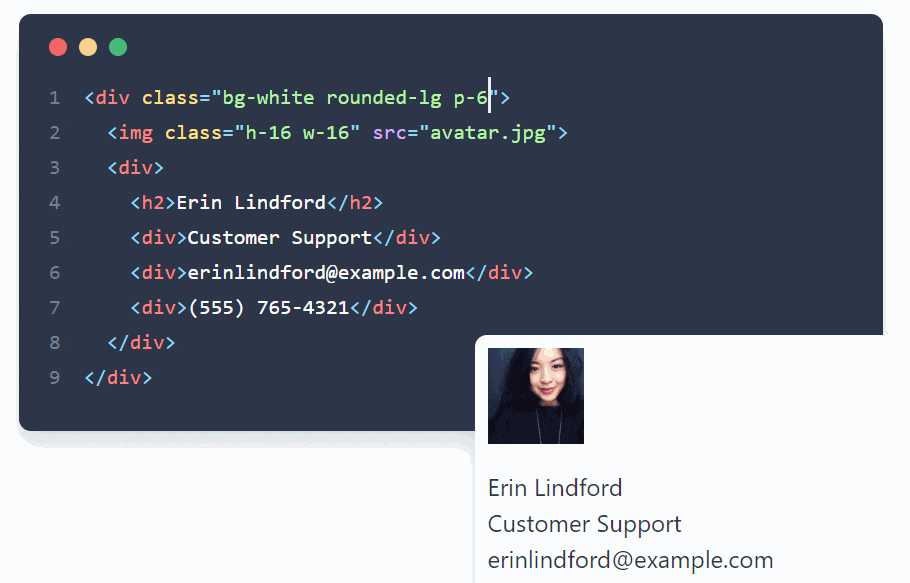
Our Design System with Tailwind
Utility classes helped us to work within the constraints of a system instead of littering our stylesheets with arbitrary values. They made it easy to be consistent with our brand color choices, spacing, typography, shadows, and everything that drives our well-engineered design system.
We’ve used;
- Tailwind’s flexbox and padding utilities to control the overall card layout
- The max-width and margin utilities (max-w-sm and mx-auto) constrain the card width and center it horizontally
- The background color, border radius, and box-shadow utilities to style the card’s appearance
- The width and height utilities to size the logo image
- The space-between utilities to handle the spacing between the logo and the text
- The font size, text color, and font-weight utilities (text-xl, text-black, font-medium, etc.) to style the card text
This approach allows us to implement a completely custom component design without writing a single line of custom CSS.